Chart Of The Day: Without Labor Force Shrinkage, Unemployment Rate Wouldn't Be Improving
By now most political observers (if not necessarily American voters in general) are well aware of the problems with the U-3 unemployment rate number. It only measures the number of people who are unemployed who meet the government’s definition of active job seekers.
The U-6 unemployment, per the BLS, presents a much more accurate picture: “Total unemployed, plus all persons marginally attached to the labor force, plus total employed part time for economic reasons, as a percent of the civilian labor force plus all persons marginally attached to the labor force.”
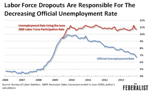
The U-3 is the “official” unemployment rate, so it gets all the attention, but as the chart above shows it doesn’t present a very accurate picture.
If we hold the labor force static at where it was in June of 2009 – and if anything it should be larger, population has grown since then – the unemployment rate has hardly decreased at all. That’s what the graph above, courtesy of The Federalist, shows.
I’m well aware of this phenomena – I’ve written about it extensively – but even I was surprised by the picture.